These results are in no way a reflection on Susan or her teachings - just my cluttered head full of many "rules" I've painted with for a long, long time. Painting with a limited palette and from dark to light finally taught me the concept of values - I used to think if I changed colors, I changed values - NOT! But, it didn't allow for considering warm/cool colors to bring items forward or back. Susan's palette has my old favorites - Phthalo Blue, Phthalo Green, Alizarin Crimson, and Aureolin Yellow - from my teachings with Lynn Ferris. She has 12 colors total that she uses - warm/cool variations, some purples and oranges for consistency - very nice selection!
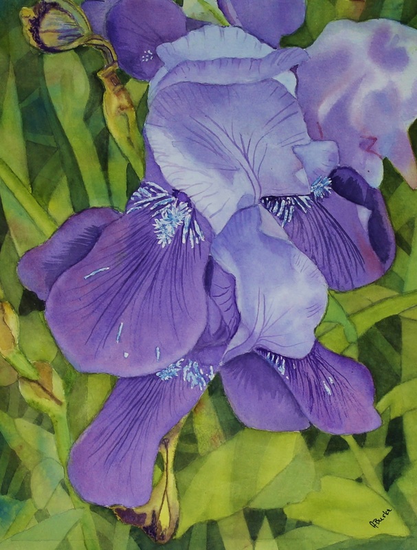
On the Iris, (2nd try) I painted the flower for 10 days - a very long time for me. It started as 18X24 (with matt) and I cut it down to 16x20 as I was so intimidated by the huge surface of leaves! I did the forefront leaves with a bit of glazing, and opted to finish with negative painting - laid down the primary colors randomly and then worked from front to back. You'll note the hard lines from the masking on the detail of the flowers - I ordered a drafter's erasing template to start using that to lift vs hard edges of masking fluid.
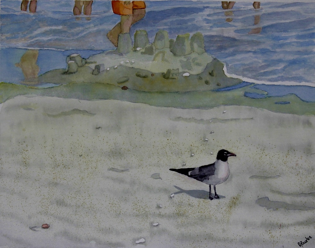
On the beach scene, this is the 3rd try. I wanted to grasp the notion of reflections in the water - I think I did that OK. I played with the water too much. I did under painting of yellow on the sand which makes it lean towards green! Yellow priming doesn't work well with blues and purples - does great with yellows, oranges, reds, greens.... I'm learning! Slowly but surely!!!
I won a free one hour critique with Susan on a Facebook contest. I'm going to save it until I get a little better - and then if I need more, I will gladly pay for additional sessions. I haven't run across anyone who teaches like this - so generous with her knowledge and talents - and so dedicated to working with students until they get it! I'm very, very happy to have found her and look forward to improving by leaps and bounds!


 RSS Feed